
inorigo® Applications
inorigo® Applications are web based solutions that through a set of components allows users to view, export and import data. Applications can vary widely in complexity, appearance and usage and are often tailored to full-fill specific needs. Working with in inorigo® Applications covers the functions available in the Applications menu and all of inorigos components that are available to Applications.
The following sections describe the functionality of viewing an inorigo® Application in a web browser.
Application Distribution
An inorigo® Application may be viewed in several ways on the web, such as:
- in the inorigo® Workbench
- embedded with HTML on a web page
- embedded in a Share Point
- embedded in Confluence
All embedded alternatives use a direct link to the Application to access it.
See the technical documentation on how to access Application definitions and data via the inorigo® web service interface.
When you embed an Application in a domain that is different from the Application domain, the browser might reject (not display) the Application unless the browser allows third party cookies or if the domain the Application stems from is exempt in the browser settings.
Example: The web page domain = yourdomain.com and the embedded Application stems from: someotherdomian.com
Obtain a Direct Link to an Application
To embed an inorigo® Application on the web, a direct link to the Application must be obtained. To obtain the link, right click an Application in the list of Applications in the Workbench and choose Open in new browser tab. In the window that appears, hit Ctrl-C to copy the URL to the clipboard.
inorigo® Workbench
All Applications are automatically available from within the inorigo® Workbench under Library – Applications (at the bottom of the Library sidebar).
Bookmark an Application to make it visible under Library – Bookmarks.
Double click an Application to open it in a tab in the Workbench.
To open an Application in a new browser window, right click the Application in the Library and choose Open in new browser window, or double click the Application tab header if the Application is already opened.
Note
The browser must allow popup windows to be able to open an Application in a new browser window. If popup windows are blocked, go to browser settings and allow popup windows.
Access Rights
When an Application is requested (from within the inorigo® Workbench or with a direct link) inorigo® verifies that the requesting user has the rights neccessary to access the View. If inorigo® is set to use single sign on (SSO), the verification and login process is done automatically. If not, username and password must be filled out manually. See Access Rights for detailed information on how to log in and log out of the Workbench.
Note
Users must exist in inorigo® to be able to view inorigo® content on the web!
Once logged in to the Workbench, only authorized Applications are visible. Requests for unauthorized Applications that are embedded (i.e. with a direct link), prompts the user with the browser login dialog window.
How to Publish and Embed Applications
This section describes step by step how to distribute your Applications in a web environment.
If you want to distribute an Application with a technique not listed below please read how to extract the Application URL: With plain HTML and consult the appropriate documentation for your publishing environment.
Inorigo Workbench
How to publish an Application in the inorigo Workbench.
1) Create an Application according to To Define and Edit an Application
2) Assign view rights to the Application consumers: Access Rights to Applications
SharePoint
- Example below is referring to SharePoint 2013
- You need to have the proper knowledge and access to Sharepoint gadgets
1) Create an Application according to To Define and Edit an Application
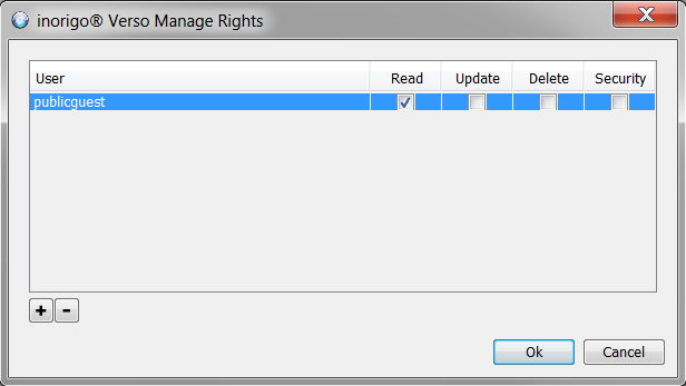
2) Assign view rights to the Application consumers: Manage Rights
3) in the Workbench right click on the Application and select Bookmarks
4) Edit the SharePoint page where you intend to embedd the Application
5) Select the INSERT tab – “Embed Code” in the menu
In the Pop up you need to paste the code in an iframe format:
 example:
//<iframe src=”http://www.ortelius.com”><span data-mce-type=”bookmark” style=”display: inline-block; width: 0px; overflow: hidden; line-height: 0;” class=”mce_SELRES_start”></span><span class=”nolink”><span data-mce-type=”bookmark” style=”display: inline-block; width: 0px; //overflow: hidden; line-height: 0;” class=”mce_SELRES_start”><span data-mce-type=”bookmark” style=”display: inline-block; width: 0px; overflow: hidden; line-height: 0;” class=”mce_SELRES_start”></span></span></span></iframe>
Change the greyed out text with the link you copied from the Application and if necessary, modify other parameters such as Height and width to match the desired size of the window.
Confluence
How to publish an Application as content in Confluence
- The example below is referring to Confluence 5.1
- You need to have purchased the HTML plugin (not part of Confluence)
1) Create an Application according to To Define and Edit an Application
2) Assign view rights to the Application consumers: Access Rights to Applications
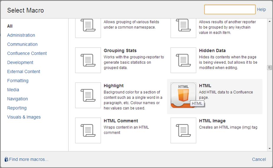
3) In Confluence insert a HTML macro by
a) clicking the insert button and selecting Other macros
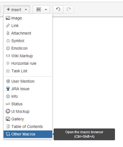
b) selecting the HTML macro
(adjust the height and with parameters to suite the embedded Application).
Distribute a Public Application
When you want to distribute an Application accesible to anyone.
Step-by-step guide
|
What
|
Step/-s
|
Picture/link
|
|---|---|---|
| Prerequisites |
|
These actions require System Administrator access. |
| Set rights |
|
|
| Construct the URL |
|
https://inorigodemo.ortelius.se/demo/verso?id=6630a11c-e8e8-049d-edbe-a32f00e75fEAB
https://inorigodemo.ortelius.se/demo/public/verso?id=6630a11c-e8e8-049d-edbe-a32f00e75fEAB |
| Distribute link |
|
When you distrubute a public Application note the following:
When a user with access rights to inorigo, who opens an Application in public mode, is logged in with it’s own user rights, not the rights of the guest user account.
Distribute Application
Confluence
How to publish an Application as content in Confluence
- The example below is referring to Confluence 5.1
- You need to have purchased the HTML plugin (not part of Confluence)
1) Create an Application according to To Define and Edit an Application
2) Assign view rights to the Application consumers: Access Rights to Applications
3) In Confluence insert a HTML macro by
a) clicking the insert button and selecting Other macros
b) selecting the HTML macro
4) In the macro use and the Application URL. Se example below. Syntax details are found at: htmlquick.com

inorigo Workbench
How to publish an Application in the inorigo Portal.
1) Create an Application according to To Define and Edit an Application
2) Assign view rights to the Application consumers: Access Rights to Applications
SharePoint
- Example below is referring to SharePoint 2013
- You need to have the proper knowledge and access to Sharepoint gadgets
1) Create an Application according to To Define and Edit an Application
2) Assign view rights to the Application consumers: Manage Rights
3) On the web portal right click on the Application and select option inorigo® Portal Bookmarks
4) Edit the SharePoint page where you intend to embedd the Application
5) Select the INSERT tab – “Embed Code” in the menu
In the Pop up you need to paste the code in an iframe format:
example:
Change the greyed out text with the link you copied from the Application and if necessary, modify other parameters such as Height and width to match the desired size of the window.
With plain HTML
How to publish an Application as content in a web page.
1) Create an Application
2) Assign view rights to the Application consumers
3) In the inorigo Workbench, right click on the Application and select Open in new browser tab and copy the URL from there.
4) Paste the URL paste it within a html iframe tag using the format below.
<iframe src=”webpage address” width=”750px” height=”640px”><span data-mce-type=”bookmark” style=”display: inline-block; width: 0px; overflow: hidden; line-height: 0;” class=”mce_SELRES_start”></span><span data-mce-type=”bookmark” style=”display: inline-block; width: 0px; overflow: hidden; line-height: 0;” class=”mce_SELRES_start”></span>border:none;</iframe>
adjust the height and width parameters to the embedded Application
Web component distribution
All web components visible with header will have a partly hidden option to open them in a new browser tab. Just double-click the header to do just that. The component will be opened in a new tab in browser with its own unique URL, which can be distributed to any user since /public will be included in URL.
This is very useful when sharing charts or any other Result component, since it is updated live while performing new selections in the filter component(s) connected with it.
Application Toolbar
Locks
Make any and press lock to keep from selecting other units. You are still able to refine your selection by selecting units within your locked selection range. Notice that locks only apply to you and your current runtime of an application, next time it is opened any applied locks will have been reset.
Save Selections
To bookmark a new selection, select the desired units in an Application and press 
When saving a selection you have the option to set what tabs that should be opened when the Application is launched. If the Application view is split and multiple tabs are visible at the same time, you may set a focus for multiple tabs.
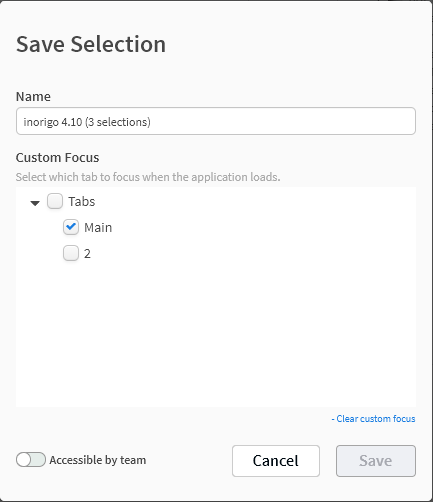
Enable Accessible by team to allow other users to make use of the saved selections. Notice that users require update rights for the Application in order to saved selections for teams.
Distribute saved selections in the following ways
- Saved Selections that has been made accessible by team can be accessed by all users in the instance, who has a bookmark for that application. The saved selection is found under the applications bookmark.
- The URL used to open the Application with saved selections can be distributed to any user with access to the application, by copying it from the browser.
Clear Selection – Clears current selection
Calculate – Run the current selection to trigger result components (only necessary if Auto Calculate is disabled)
Auto Calculate – Toggle automated calculations, enabled by default.
Load Selections – Load your or team members saved selections for the current application.
Reload – Reload all data in the application, current selections always remains.
A blue dot indicates that data in the application has been updated elsewhere. Until reload is pressed (or the browser window is refreshed) the data remains in its current viewing state.
A red dot indicates that the reload of the Application on the server is finished, and there is a newer version of the Application available in the server memory.
Application URL Parameters
Display Modes
Display Modes has been introduced in order to easily control Application layout.
This will set the visibility of its main components Title, Toolbar, User and Footer according to the
matrix below.
| Component | |||||
|---|---|---|---|---|---|
| Mode | Title | Toolbar | Footer | User | Remark |
| Browser | true | true | true | true | Default when an Application is opened in a separate browser tab. |
| Component | false | false | true | false | Default when an Application Component is opened in a separate browser tab. |
| Embedded | false | true | false | false | Default when an Application is embedded within an other Application (The Web Page component). |
| Gadget | false | true | false | false | Default when an Application is displayed within the inorigo Workbench. |
| Portlet | true | true | true | true | Use this mode when displaying an Application as a portlet within an external web page. |
| Stripped | false | false | false | false | Use this mode in order to show only the actual content of an Application. |
When these Display Mode parameters are added to the URL default display settings are overruled.
Example
Add the modes by adding
Example: …/public/verso/9b5efd39-92d3-cdbd-dbf9-a8fc00ae30a0?DisplayMode=Browser
Override
To override the default settings for each Display Mode simply supply separate parameters for each component.
Examples
…/public/verso/9b5efd39-92d3-cdbd-dbf9-a8fc00ae30a0?DisplayMode=Browser&Toolbar=False&Footer=False
…/public/verso/9b5efd39-92d3-cdbd-dbf9-a8fc00ae30a0?Toolbar=False&User=False
Deprecated
To use Application Display Modes, please remove all other settings (i.e standalone, showheader etc) since these are deprecated and might not work in future releases.
Selections
Utilize application selection parameters to send a link to an Application with a predefined set of selections or store in Favourites in browser for quick and easy access the next time.
You can use any filter box that has a unique identifier (pX) for your selection.
How to:
- Open the Application in a new browser window
- to the URL, add box id. and a value as query string parameter to select item. Repeat &pX=value for each new item in selection (replace X with the filter box id).
- To lock the selection, simply add parameter &lock=true
Values can be supplied as Text representation or as unique identifier. Value should never contain spaces since this is considered an invalid URL. Replace space with %20 which is supported by all browsers.
Example:
An Application holds a filter box with continents (p0) countries (p1) and a map. Open the Application in new browser window and add selection according to:
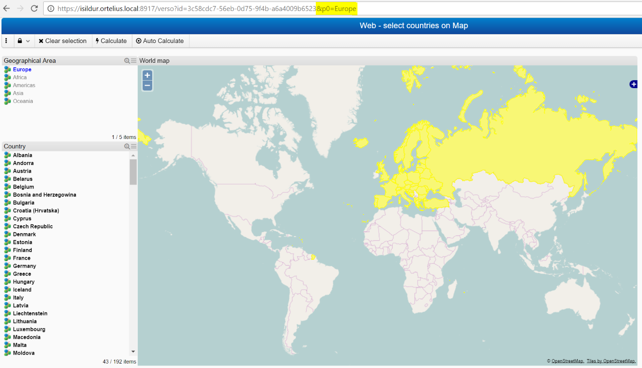
Use either p0 or p1 to perform selection
And yet more; since all the filter boxes have unique identities, they will be available for URL selections regardless of which tab they reside. One can thus make a composite selection from several tabs for distribution.
Focus Components
The following variable
&focus=
can be used to focus components and panels when an Application is loaded.
Example: https://instance.url/verso/1de19003-fc75-dd5b-7190-aad900b2bf6a?DisplayMode=Browser&focus=p3
Result: The panel that component p3 is located on will be opened.
For applications with multiple tabs in split panels, several components can be targeted.
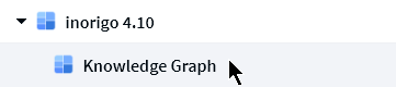
Example: the ID of a Knowledge Graph and the Variable Name of a filter component have been targeted
https://inorigo.url/verso/applicationID?DisplayMode=Browser&focus=4F244534-F2FB-6D3C-A01C-AA5600B93FA1&focus=p61
Result
The following identifiers can be targeted
ID – rightclick a component / panel in the context navigator or main panel in Application builder to obtain
Name
Variable Name – pX number for filter components
Focus can also be bookmarked and is available over the API
Application Components
Filter Components
Filter Component example.
Filter component menu
Click the  in the filter component title bar to expand component tools. The available and visible tools may differentiate between filter components.
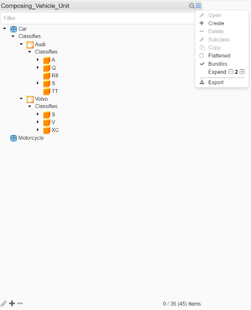
The functions available are:
|
Function
|
Description
|
|---|---|
 |
Filter field allowing for searching/filtering the component content.
Filter will ignore Locale setting while filtering numbers, i.e thousand separator white space and comma will be ignored. The inorigo® Application Builder layout setting Search field visible decides whether or not the search filter by default should be visible or hidden. |
 |
Open the selected object in Attribute Value panel |
 |
Create a new object |
 |
Delete the selected object |
 |
Create a new subclass to the selected object. |
 |
Copy the selected object |
 |
Bookmark the selected object. Note; this requires the Application to be opened in new tab in the Workbench |
 |
The list is “hierarchical”. Clicking it displays the content in a flat list. |
 |
Show or hide the relation between objects in hierarchical – Recursive – structure |
 |
Expands and collapses hierarchical node trees |
 |
Exports the filter component contents to MS Excel; all content when nothing is selected or just the selected items |
 |
Open/Edit, Create and Delete buttons |
 |
Shows number of selected items/total and (filtered) number of items visible in the box.
The inorigo® Application Builder layout setting Counter Visible and Footer Visible will decide if this is visible on web. |
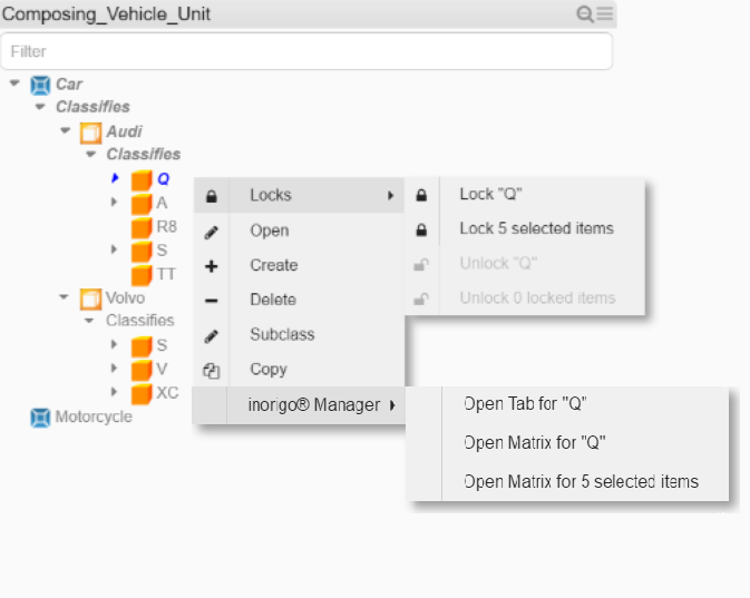
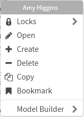
Filter component context menu
Some of these options are also available from the context menu in filter components, revealed by right clicking units inside the filter component.
|
Function
|
Description
|
|---|---|
 |
Reveals lock menu |
 |
Open the selected object in Attribute Value panel |
 |
Create a new object |
 |
Delete the selected object |
 |
Create a new subclass to the selected object |
 |
Copy the selected object |
 |
This option will open the selected item in inorigo® Model Builder |
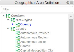
When a filter component displays any structure (Composition, Classification or Recursive structure), the parent nodes are indicated with a triangle pointing down (open) or right (closed)
Note
Filter components containing external links cannot be used for filtering content in other components. When selecting an external link the browser opens the link destination instead.
Input Panels
Input panels are used to create, edit or delete units. Only certain filter components allows for unit editing, typically those with the editing buttons  visible under the component. In some components editing may also be accessed by right-clicking units in the filter component.
The number of entries or selections in an input panel depends on the settings and type of units that you are editing. In order to complete an input to create or edit a unit, make sure that all red fields and fields marked with an asterisk * are filled out. Until they are, it will not be possible to press save.
For some fields, like Telephone Number in the image below, you may choose a number of entries by adding new fields to the panel.
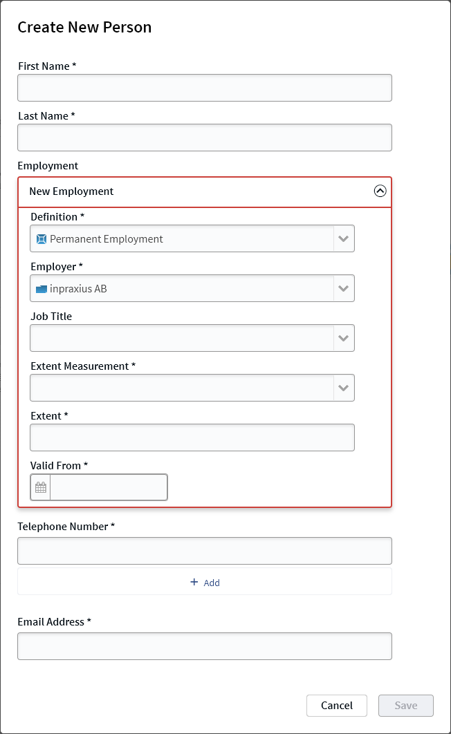
Once save is pressed, the new unit is created/updated immediately and will appear in the filter component.
Compact
Designer should be aware of the following when defining a Filter component as Compact:
- does not support Classification or Composition structures, i.e. only flat.
- does not support multiple selections
- does not support context menu when managing inorigo® objects, options are only available from Menu and Buttons

While searching the Compact Filter component, indicators help you navigate and orientate in the list:

The criteria used when evaluating the filter search is Contains, just as in an ordinary Filter Component.
Calculation Box
A Calculation Box example.
The calculation box show calculations based on information in other filter components in the Application and in the underlying information model.
More information about setting up the calculation box, or embedding an HTML page inside it is available under calculation box in the application builder documentation.
Selection Box
The web version of Selection Box supports all features available in settings as described in section Selection Box under Working with inorigo Application Builder
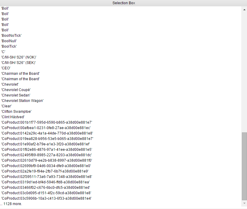
Example of Selection Box
Selection Box is now limited to show a maximum of 100 items per Filter Box. A trailing overflow item will be added if the limit is reached.
Image Component
An Image is a static picture, for example a company logo, placed in an Application. Selections or other user interactions cannot affect images inside an image component.
Note
The Image component should not be confused with the Resource Viewer.
Text Area
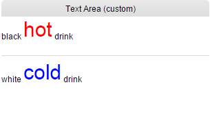
Example of a custom Text Area on the web
The Text area component contains static text like information, headers, etc. Selections or other user interactions cannot affect the text inside the component. The header of the component is often hidden to hide the component window and display only the text in the Application.
Resource viewer
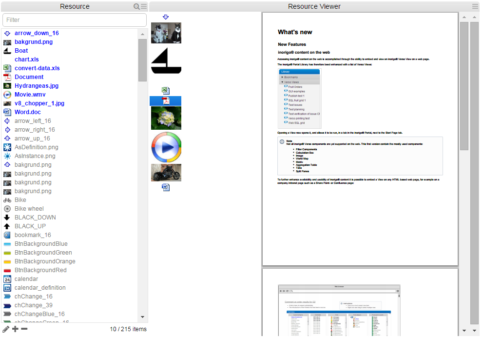
Resource viewer example, browser supporting the source format for direct display.
The Resource window to the left is a normal Filter component.
Resource Viewer component to the right has two parts; the left one listing the result of the selection made in Filter component, and the right displaying the result of clicking on an item in the list, this is configurable in the Layout settings in inorigo® Application Builder. External documents supported for direct view in Resource viewer is currently pdf files and xls charts.
Browser capabilities
The display of resources are depending of browser capabilities, installed plugins etc. A context menu offers a limited set of choices that are available in the current state, or context, of the Resource viewer. The available choices are actions related to the selected object, as it would do in the example below, when performing a mouse right-click on the icon that represents the object not being displayed.
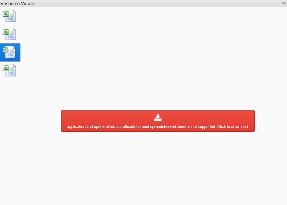
Another Resource viewer example, browser not supporting the source format for direct display, click the red area to download for view in a default program associated with the file type.
Click the  in the top right corner of resource viewer title bar to expand component tools.
The functions available are:
|
Symbol
|
Function
|
|---|---|
 |
When ticked, the object being displayed is adjusted to the available viewer area . |
 |
Download the resource |
World Map

A World Map Example (with a few countries and major cities selected). In this map, Heat variable is used based on population, which is indicated by the different colors of the plotted items.
The World Map highlights countries selected in a filter component with countries (it is not possible to select countries directly in the map).
Zoom in and out by using the zoom buttons in the upper left corner (1),  for zooming in and
  for zooming out. Another way to perform zoom is to use the scroll wheel on mouse. To pan the map, press the left mouse button and hold it down while moving.
In 3D mode there are additional tools available;  is used for tilting the Application,
  is the default top-down view for panning and zooming and
  shows the orientation of map, where the dark arrow is north.
Based on the selection and zoom level, the map will try its best to adjust pan and zoom to show the selected items. This will of course work better in 2D than 3D.
In the upper right side of map (2), there are menu options available to customize the map content, accessible via

Toggle 2D/3D map and hide/show layers.
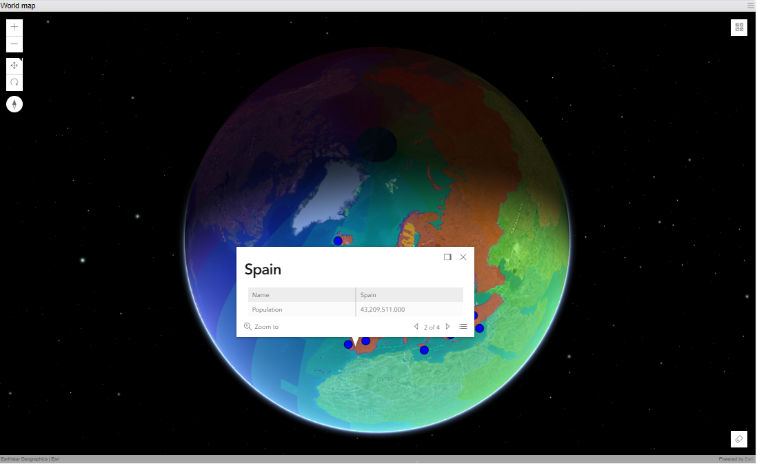
A 3D map example, where one selected item has been clicked and shows the Info panel. The Info panel can be configured to show any data using expressions.
The Info panel is updated when another item is clicked in the map.

The contents and features of the Info panel:
|
What
|
Description
|
|---|---|
|
|
Docks the Info panel to the upper right corner of map |
|
|
Close the panel |
|
|
Zoom in to the selected object |
|
|
When many layers (areas) are put on top of each other, it is possible to select the layer to show info for by clicking arrow (only works in 3D) |
|
|
Same as previous, a menu to select layer display info (only works in 3D) |
The other menu (3) in the upper right corner of map, gives the possibility to change the base map used as background and there are 10 different to choose from, accessible via the menu  . This setting is not permanent; a refresh of the Application will restore the original Base map.
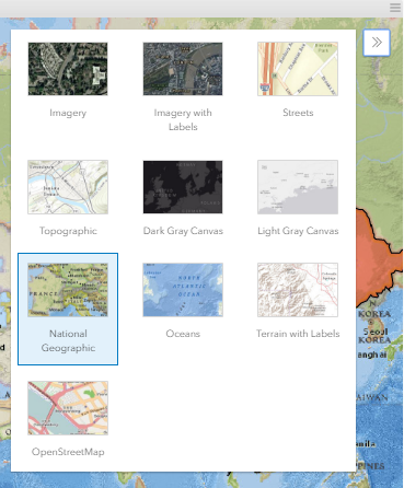
Different Base map options
If Heat variable is used on the plotted items in map, the Legend of the variable is available via 
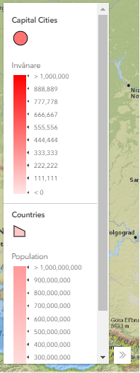
Map Legend(s)
Charts
The purpose of the charts is to display the information from the filter components to present the information in a graphical and useful way.
Bar Chart
All settings available for inorigo® Application Builder Bar charts are also applied in the Application on web. Charts are populated with data from any Filter component as specified in Content Settings, in inorigo® Application Builder:
| X-Axis Values | Specifies, with an expression, where the values on the x-axis comes from. |
| Y-Axis Values | Specifies, with an expression, where the values on the y-axis comes from. The y-axis can handle numerical values as well as numerical strings, i.e. strings that contain only numerical figures. |
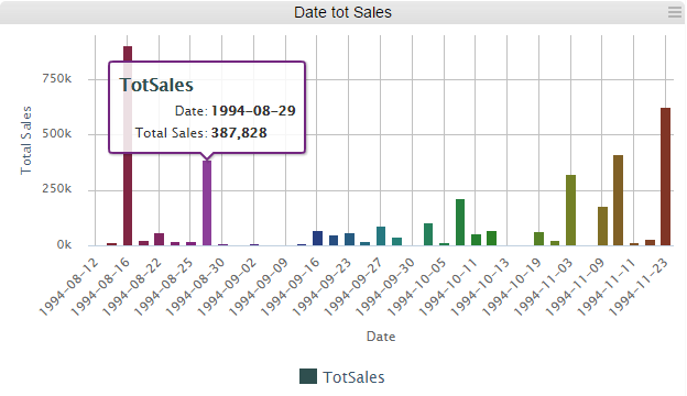
An example of a Bar chart
Hover
Moving the mouse over a bar in the chart will reveal the object properties as specified in settings in Application Builder.
Select
A mouse left-click on a bar in chart will outline the object. It is possible to select several bars combining the mouse left-click with Ctrl-button.
Chart warnings
Using chart Fixed Axis displays warnings on each Bar exceeding the minimum and maximum preset in configuration, see example below.
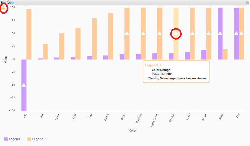
There are three indicators on web, one for each Bar and the tooltip, and the third in upper left corner that returns a summary for the entire chart.
Bubble Chart
All settings available for inorigo® Application Builder Bubble charts are applied in the Application on web. Charts are populated with data from any Filter component as specified in Content Settings, in inorigo® Application Builder:
| X-Axis Values | Specifies, with an expression, where the values on the x-axis comes from. |
| Y-Axis Values | Specifies, with an expression, where the values on the y-axis comes from. The y-axis can handle numerical values as well as numerical strings, i.e. strings that contain only numerical figures. |
| Bubble Size | Specifies, with an expression, where the values for the bubble size comes from |
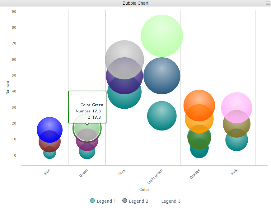
Example of a Bubble chart
Hover
Moving the mouse over a bar in the chart will reveal the object properties as specified in settings in Application Builder.
Select
A mouse left-click on a bubble in chart will outline the object. It is possible to select several bubbles combining the mouse left-click with Ctrl-button.
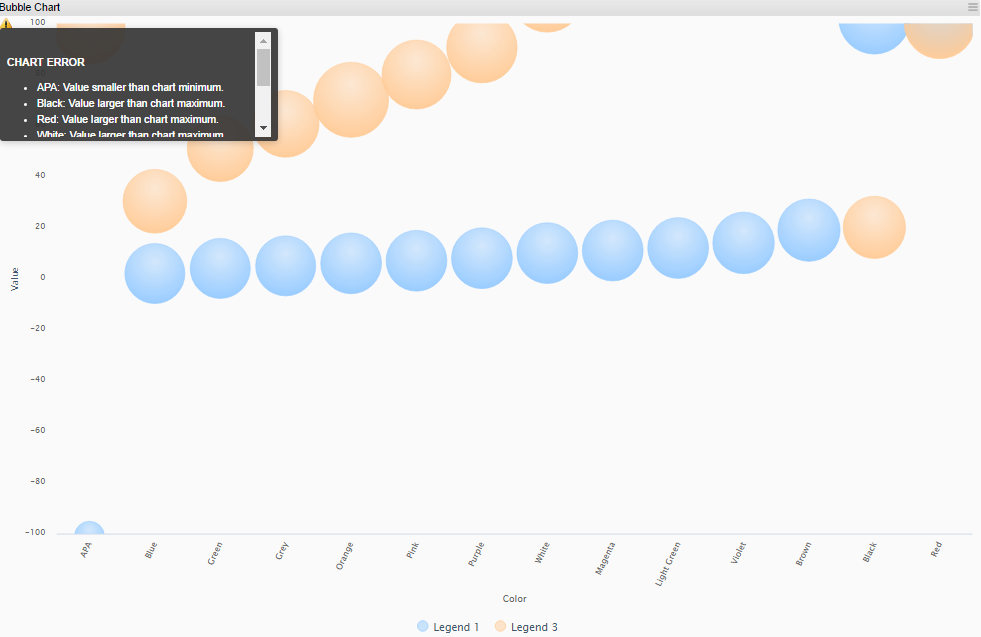
Chart warnings
Using chart Fixed Axis display a warning icon in upper left corner that contains information on each value exceeding the minimum or maximum preset in configuration, see example below.
Line Chart
All settings available for inorigo® Application Builder Line chart are applied in the Application on web. Charts are populated with data from any Filter component as specified in Content Settings, in inorigo® Application Builder:
| X-Axis Values | Specifies, with an expression, where the values on the x-axis comes from. |
| Y-Axis Values | Specifies, with an expression, where the values on the y-axis comes from. The y-axis can handle numerical values as well as numerical strings, i.e. strings that contain only numerical figures. |
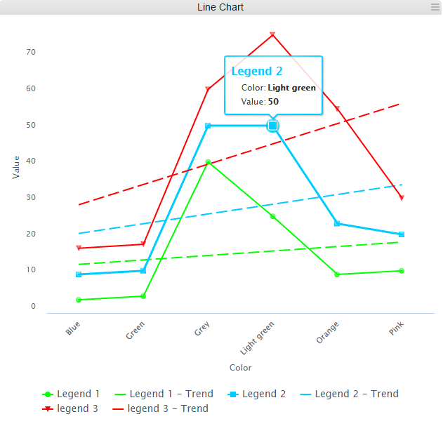
Example of a Line chart
Hover
Moving the mouse over a (trend) line in the chart will reveal the object properties as specified in settings in Application Builder.
Select
A mouse left-click on a dot in chart will outline the object. It is possible to select several dots combining the mouse left-click with Ctrl-button.
Chart warnings
Using chart Fixed Axis display a warning icon in upper left corner that contains information on each value exceeding the minimum or maximum preset in configuration, see example below.

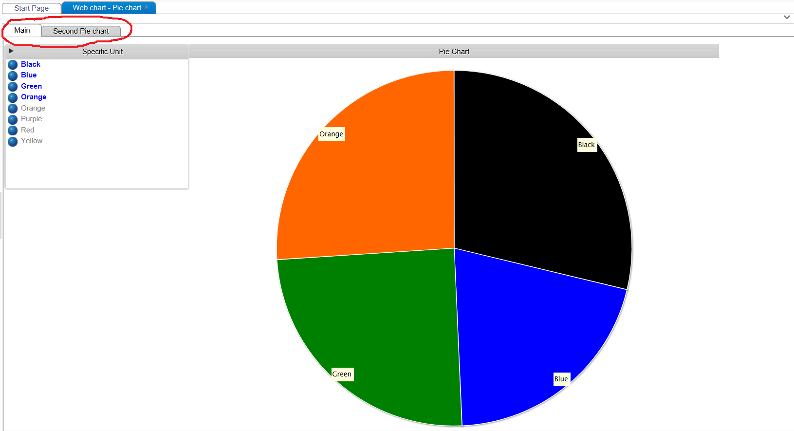
Pie Chart
Video tutorial on the Pie Chart Component
All settings available for inorigo® Application Builder Pie chart are applied in the Application on web. Charts are populated with data from any Filter component as specified in Content Settings, in inorigo® Application Builder:
| Sector Names | Specifies, with an expression, where the name of the sectors come from. |
| Sector Values | Specifies, with an expression, where the values (the size of the sectors) come from. |
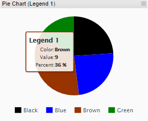
An example of a Pie chart
Hover
Moving the mouse over a segment in the chart will reveal the object properties as specified in settings in legacy Application Builder.
Select
A mouse left-click on a segment in chart will explode the object. It is possible to select several segments combining the mouse left-click with Ctrl-button.
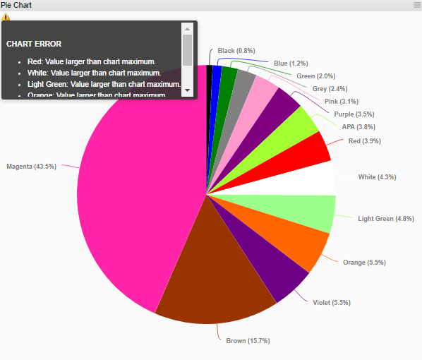
Chart warning
Using chart Fixed Axis display a warning icon in upper left corner that contains information on each value exceeding the minimum or maximum preset in configuration, see example below.
Meter
Video tutorial on the Meter Chart component
All settings available for inorigo® Application Builder Meter charts are applied in the Application on web. Charts are populated with data from any Filter component as specified in Content Settings, in inorigo® Application Builder:
| Value | Specifies, with an expression, where the value (shown with the meter hand) comes from. If several values are selected, the values are summarized. |
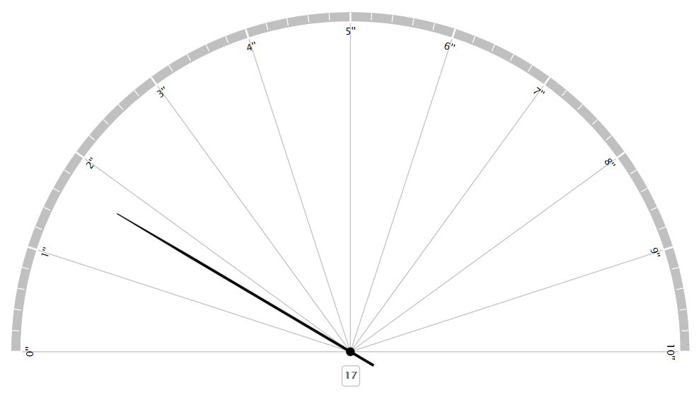

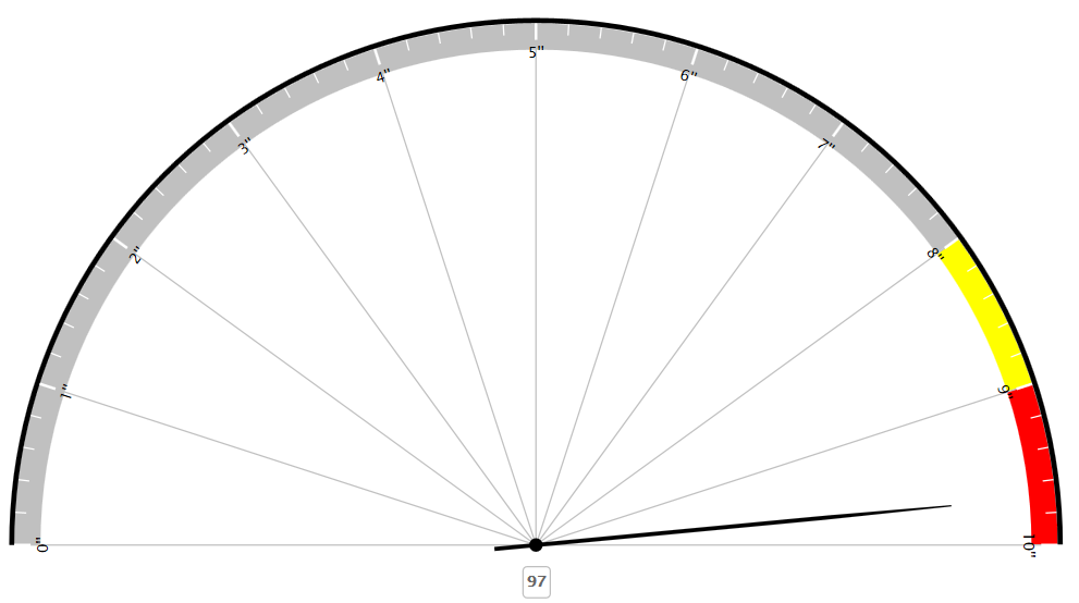
Examples of a Meter chart
Error in Chart
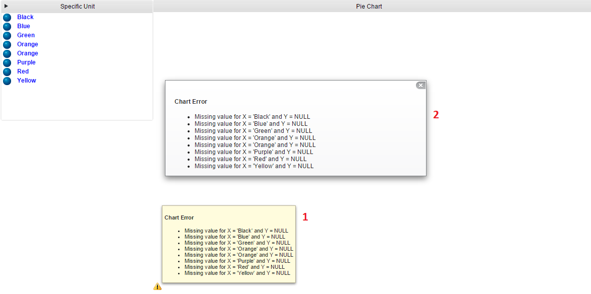
An error in a chart on the web is indicated by a small icon in lower left corner of the chart.
There are two ways to get information about the error, either hover the cursor over the icon to get a quick overview of the problem described by (1), or click on the icon to get a fix display of error displayed by (2).
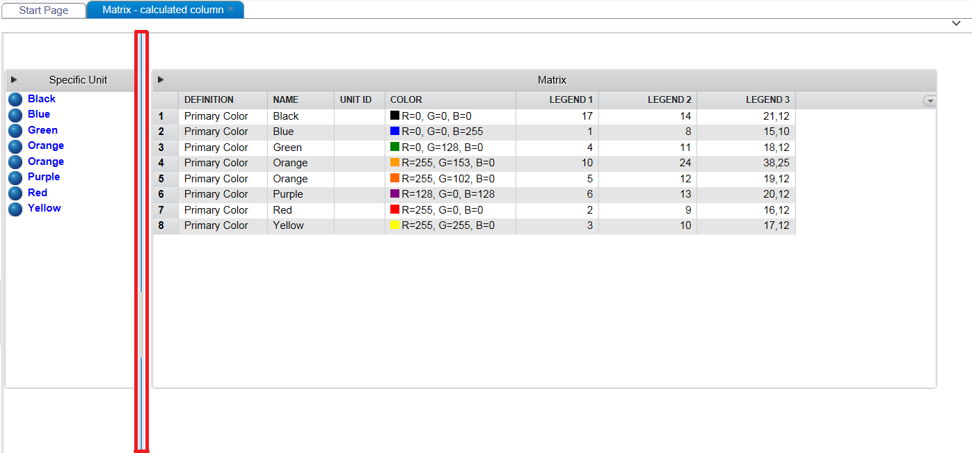
Matrix

A Matrix example.
Sorting
To sort the data, click the column heading you want to order by. The first click will set up a sort of ascending type ( ). A second click on the same header will change the sort to descending (
 ) and a third ends the sort on that column.
To sort rows based on many columns at the same time, hold down CTRL and click as described above. There is no limit to how many additional sorts you can apply.
Note that the sorting you set up wont effect coming changes to cells and rows. The way to reenact the sorting is simply to redo the clicking of column headers you want to order by.
Click the Matrix menu  at the rightmost column header position to hide (and show) columns.

Visible column are indicated in the list with a tick mark.
Click the  in the top right corner to expand the component tools.
The functions available are:
Aggregation tables can now be sorted by the user on multiple columns by clicking on the column headers. Users may also clear the sorting through the menu command reset sorting.
Tooltips
A Matrix has the option to display tooltips for each individual cell. Click or hover a matrix cell to reveal a given tooltip.
Symbols
|
Symbol
|
Function
|
|---|---|
 |
Excel export, will export the Matrix content to a new MS Excel file. |
 |
Selected rows / total number of rows (filtered number of rows)
It is possible to right-click an object in the Matrix, and Open the selected object in Model Builder. |
 |
Open the filter field that enables filtering of the Matrix content. |
 |
Close and clear the filter field |
 |
Reset sorting on in all columns |
Note
In order to access the component tools, the setting Show Title must be checked in the Application definition.
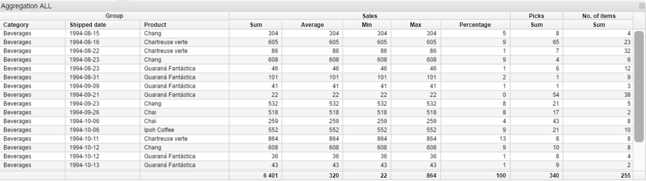
Aggregation Table
An aggregation table example.
Click in the top right corner to expand the Aggregation table tools.
|
Symbol
|
Description
|
|---|---|
|
Excel export, the table content is exported to Excel. |
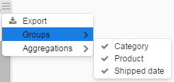 |
A menu with a list of grouping column names are displayed. By checking or unchecking the visibility is altered. |
 |
A menu with a list of calculations that can be performed on the Aggregation column(s). By checking or unchecking the visibility is altered. |
Aggregation tables can now be sorted by the user on multiple columns by clicking on the column headers. Users may also clear the sorting through the menu command reset sorting.
Tabs
An example with two Tabs.
Tabs are defined and managed in inorigo® Application Builder.
Note
Web Application Tabs are displayed at the upper part of the Application (as opposed to Tabs in inorigo® Application Builder, that display the Tabs at the lower part of the Application).
It is not possible to move or rearrange the Tabs in an Application on web.
Split Panes
A Split Pane separates different Application groups with a Split Bar, indicated with a red rectangle in example above, and is created when groups are placed adjacent to each other while defining the Application in Application Builder.
Hovering over a Split Bar displays a double arrow,  , indicating that it may be moved to change group proportions.
Knowledge Graph
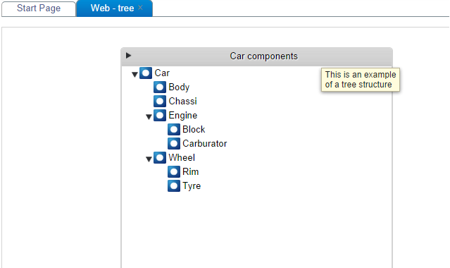
When multiple units are explicitly and implicitly selected in two or more filter components we cannot determine what units that connects to which. The knowledge graph does great job at meeting that need.
Tree structures are generated to display the relation between all selected units that has been included in the Knowledge Graph.
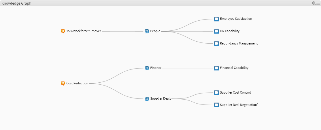
By default, Knowledge Graph is expanded scale to fit the defined area and visualization is set Left to Right.
 The default mouse pointer symbol when managing objects in Connection graph box
 The default mouse pointer symbol while zooming and panning.
Knowledge Graph Features
- Dragging units – Point the mouse on a unit in the graph and the pointer will change to a hand. Drag the object in the graph to put it in another location. Connection lines will follow while dragging units.
- Collapse and expand – Expand and Collapse branches at users will simply by double-clicking any unit in the graph. Any unit having a child object attached can be collapsed.
- Highlight Connections – Highlight a connection by clicking units in the graph.
- Highlight with Search – If available, the search field can be used to highlight units and their connections as well.
- Tooltip – Hover to display the name of a unit as a tooltip
- Zoom and Pan – While mouse pointer icon is an arrow, Zoom and Pan will work in entire graph box.
- Zoom out: Shift + mouse double-click or scroll wheel on mouse.
- Zoom in: mouse double-click or scroll wheel on mouse the opposite direction.
- Pan: mouse-click and drag any direction
-
Sorting – The units in the Knowledge Graph will always be sorted on text, from left to right or top-down, depending on the Application direction selected.
Web Page in Application
This example will display filtered data from JIRA issue application, some statistics for an overview of bugs.
Lets have a look at the example:
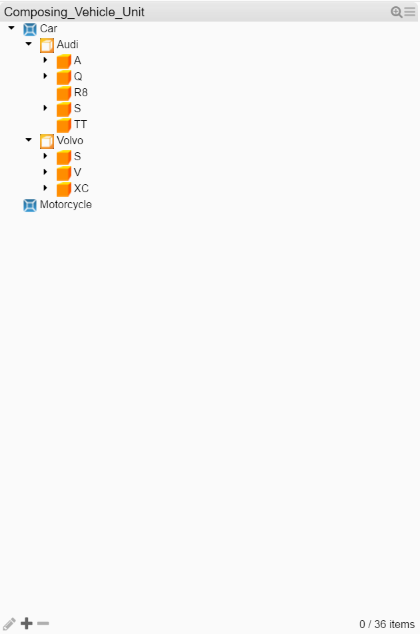
In Model Builder, create a Generic Unit with the following attributes:
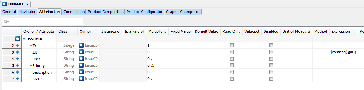
The data needed for the Specific Units is exported from JIRA and pasted into a Model Builder matrix.
Create an inorigo® Application:

First thing will be to list the Specific units in a Filter component, and link to the other filter components needed from that one.
At last, add the Web Page Result component.
The only setting change needed for that is:
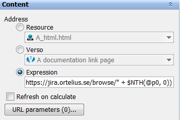
with an Expression as follows:
$IIF($SIZE(@p0) = 0, “”, “https://jira.ortelius.se/browse/” + $NTH(@p0, 0))
Explaining a bit about the expression; means that if nothing is selected, then show “” (nothing) in Web Page, else show base address https://jira.ortelius.se/browse/ + the selected item in p0 Filter component.
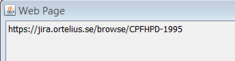
Test the setup by selecting an item in p0:
Web content is not supported by Application Builder
The address looks allright, lets save the Application and try on the web.
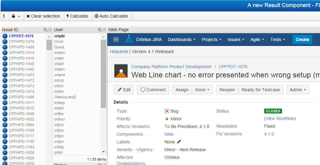
It works!
A few charts to get an overall picture of the statistics would be great, add another tab in Application Builder design and add 2 Bar charts, and here is the result:
(won’t get into details about the setting of charts)

Resulting charts.
Communication Lost Indication
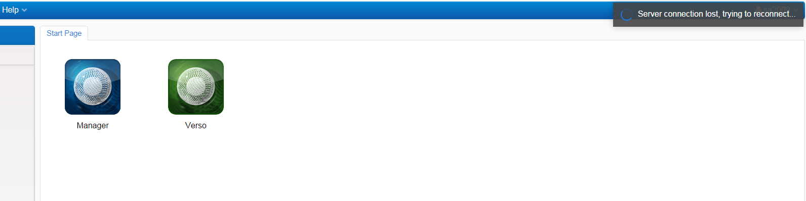
The pop-up in the upper right corner in an Application or in the Workbench will appear due to either one or both of the following reasons:
- disconnected from network
- Tomcat service or server hosting the Tomcat service has been shut down or rebooted
When connection has been established again it looks like in the following image when trying to access an Application:
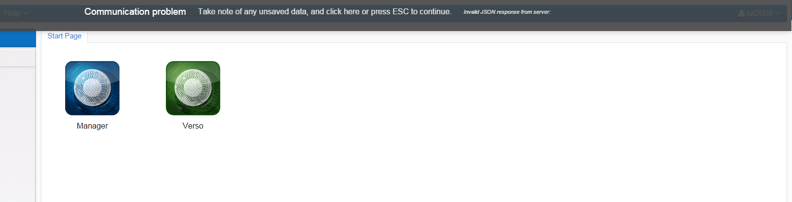
Click on the “Communication problem” banner, press Esc button on keyboard or reload the web page (F5) to refresh the web page.
Application Tools
Lock Selection(s)
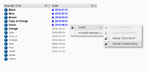
Context menu contains two options for Lock/Unlock depending on the state in which the item in Filter box is. “Lock…” is available when items are selected but not locked, while “Unlock…” is available for items being locked.
The two options in context menu are:
- Lock the item that was right-clicked to open context menu
- Lock all selected items
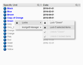
Locks all items simultaneously
Lock and Unlock is also available for implicit selected items

Objects not part of a selection Lock will get a strike through and dimmed to enhance this; they can not be selected or locked. The implicit selected items can be locked.
If the Group setting is on, blocked items are sorted after un-selectable items.
The Lock options are also available from the Application toolbar.
Open Item in inorigo® Model Builder
If user has access, the selected item will be opened and displayed in inorigo® Model Builder. The options are only available for items that have an identity in the database.

The context menu options are available for any kind of inorigo® item, explicit or implicit selected or not selected at all. The Model Builder application will be focused when items are opened.
User access
It is required that the user has the authority to view content in the inorigo® Model Builder instance where requested information resides.
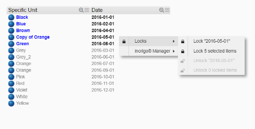
Unlock Selection(s)
Use the appropriate option from the context menu to unlock object(s).
Unlock objects one by one or unlock all at the same time
The Unlock options are also available from Application toolbar.
Show Description as Tooltip
Title bar tooltip is supported for all types of components. It can be set, enabled, or disabled through the Application Builder
Supported Browsers
inorigo Applications are tested and supported in the following browsers: Edge, Chrome, Firefox, Safari (Mac)